Ever since I was young, I have always had a passing interest in symbology. As a child I was fascinated by Ancient Egypt and their use of hieroglyphics – indeed I still am to this day – and the semiotic analysis of various signs, symbols, emblems, and logos is something that I find particularly interesting.
Some logos are universally instantly recognisable; for example, if I were to describe a logo as a swooping tick, or a pair of golden arches side by side, I am reasonably confident that most folks would be able to ascertain exactly which companies they belong to without much thought! Of course, this is fundamentally down to expert marketing sustained for many years, however it is a simple, yet powerful example of how signs or symbols can take on an inherent meaning.
Ultimately, every watch brand is a business, and in modern times, especially with social media, the image the brand portrays is a crucial part of its marketing strategy, and as such, all watch brands have their own logo – a sign or symbol designed specifically to be recognisable as attributable to the brand, and easily recognisable to as many people as possible.
With this article, I wanted to explore this in a bit more depth and understand why certain brands may have chosen the logos that they did, and what this conveys about the brands to potential consumers. I hope you enjoy!
Exploring Watch Brand Logos
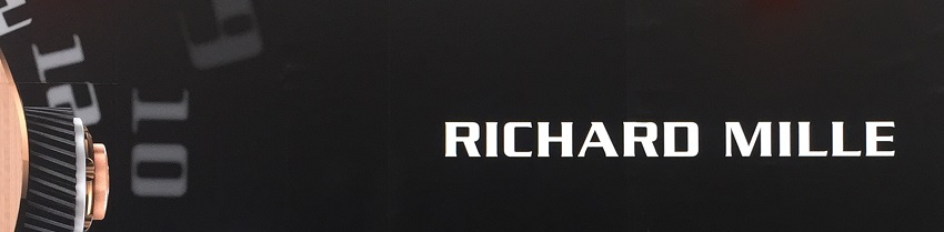
Many watch brand logos are, generally speaking, focussed on the text, placing the name of the brand front and centre. This makes perfect sense, given this is a niche market and the primary aim of a brand’s logo is to make the company behind the brand instantly recognisable to the consumer. With the name of the brand front and centre, this is very much mission complete.
Think, for example, of the likes of Cartier, Seiko, or Richard Mille.

Some brands take this a step further and choose to make a logo out of the first letter of the name, or the first letters of each word if it, such as Hublot with their ‘H’ logo, Audemars Piguet with their ‘AP’ logo, or Harry Winston with the ‘HW’ logo.
However, for this article I want to focus more specifically on examples of watch brand logos which incorporate a specific sign or emblem into the logo which go beyond simply the name of the brand, or its initials, and explore the connotations of what these emblems might mean with respect to the brand that uses them. There are more of these than you might expect, each of which has an interesting story behind it – here are five of my favourites:
Vacheron Constantin’s Maltese Cross logo
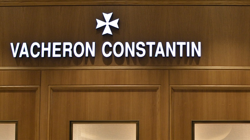
Founded in 1755, Vacheron Constantin is one of the oldest watch brands that still exists today. The brand adopted the Maltese Cross logo when it was registered by Vacheron Constantin in 1880, and has been used ever since.
Interestingly, the choice of the Maltese Cross was inspired by the shape of a component of a movement which was mounted on the barrel – something we still see in Vacheron Constantin watches today, whether it be a Maltese Cross perhaps adorning the column wheel in a chronograph movement, or even a Maltese Cross motif tourbillon cage.
Whilst the brand adopted the Maltese Cross as its logo, as a symbol it had been around for many years before as the symbol of the legendary Knights of Malta, or formally the “Sovereign Military Hospitaller Order of Saint John of Jerusalem, of Rhodes and of Malta”, who took over the islands of Malta in 1530. The eight points of the Maltese Cross represent the eight traits of the Knights: to have faith, repent their sins, exhibit humility, be truthful, just, merciful, sincere, and to endure persecution.
Over time, I think this logo has adopted a deeper meaning, too. Continually using this truly historic logo since 1880 seems both appropriate and reflective of the prestige and history of Vacheron Constantin.
Patek Philippe and the Calatrava Cross
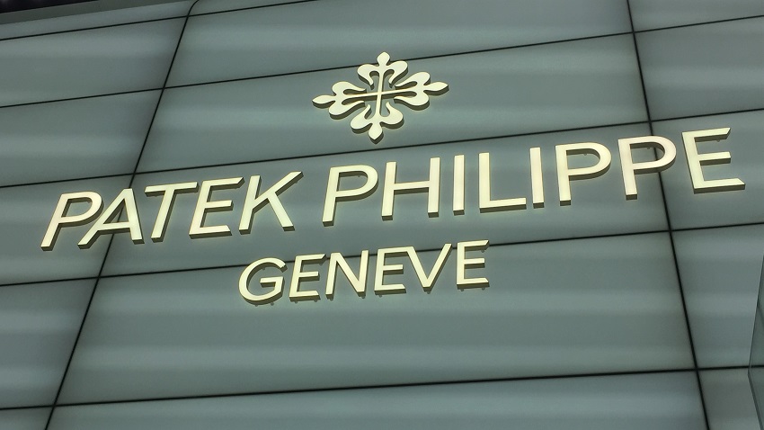
The first incarnation of Patek Philippe as a brand, was in fact Patek, Czapek & Cie, founded by Antoine Norbert de Patek and François Czapek in 1839. However, the Calatrava Cross was not adopted by the brand as a logo until 1887.
Patek Philippe’s later adoption of the Calatrava Cross coincides with a period of heightened counterfeiting within Swiss watchmaking; in Nicholas Foulkes’ Authorised Biography of Patek Philippe, he describes how other watchmakers of the era had started shamelessly signing watches with names such as “Pateck Philippe”, and this had ultimately led the brand to register the Calatrava Cross as its official trademark, which was officially validated as Patek Philippe’s logo in 1891.
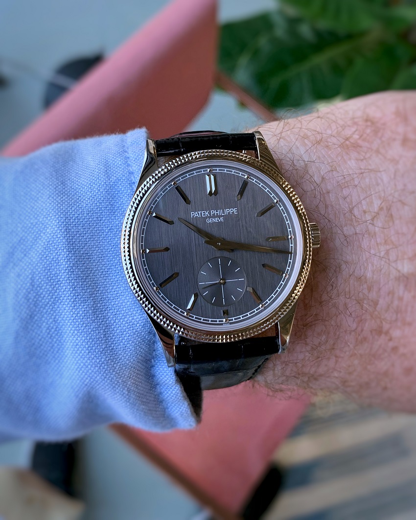
Patek Philippe Calatrava - 6119G
Itself, the Calatrava Cross is a cross bearing a fleur-de-lis at each end, and was the emblem used to represent the Order of Calatrava – one of four Spanish Military Orders – and dates back as far as the Twelfth Century. Today it is used by Patek Philippe as their logo, often for the clasps on their leather straps, and is the name of their family of Calatrava dress watches such as the 6119 reference shown above.
In a similar vein to Vacheron Constantin’s use of the Maltese Cross, the use of the Calatrava Cross by Patek Philippe evokes a sense of history and prestige about the brand. Whilst Patek Philippe as a brand is 84 years younger, the connotations afforded using such an historic logo serve much the same purpose.
When Patek Philippe adopted the Calatrava Cross, they were already very highly regarded as one of the finest watchmakers, and so this elegant logo would certainly have helped to convey this sentiment.
Rolex – the iconic Crown logo
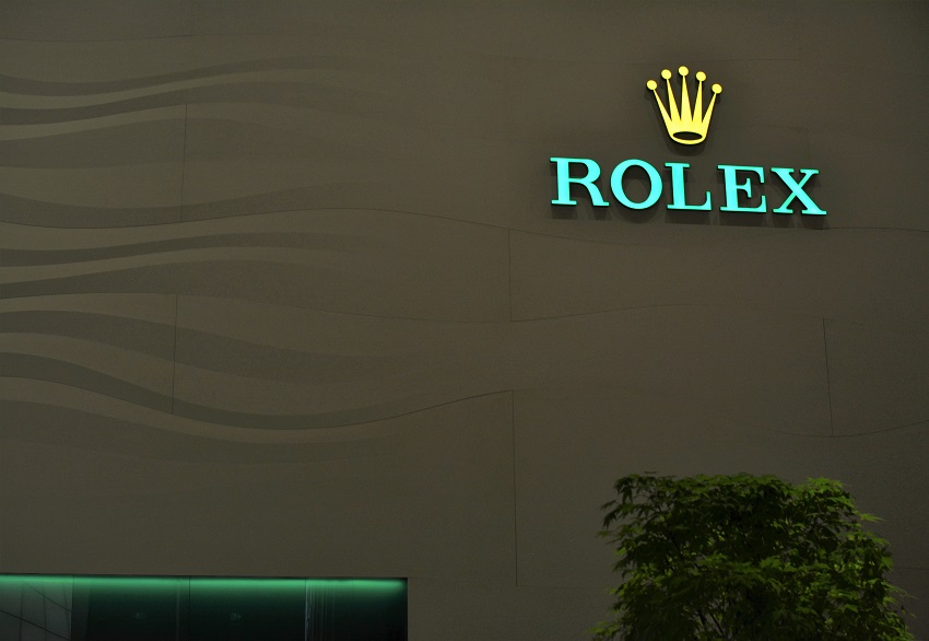
At the beginning of this article, I described how some logos around the world are, simply put, instantly recognisable – the Rolex Crown is one such logo.
Throughout its history, Rolex has been one of the most brilliant marketing machines, and this continues today with the sponsorship of global events such as Formula 1, Grand Slam tennis events, golf, equestrian events, yachting and sailing events… if you asked 100 people to name a watch brand, you can rest assured that the vast majority will likely respond with ‘Rolex’.
The Rolex logo has remained consistent since the brand was founded in 1905 and chose ‘Rolex’ as the name of its watches in 1908. The origins of the name are much debated (one such suggestion I have seen is that it means hoROLogical EXcellence), however on their website, Rolex quotes Wilsdorf simply saying “I tried combining the letters of the alphabet in every possible way. This gave me some hundred names, but none of them felt quite right. One morning, while riding on the upper deck of a horse-drawn omnibus along Cheapside in the City of London, a genie whispered ‘Rolex’ in my ear”.
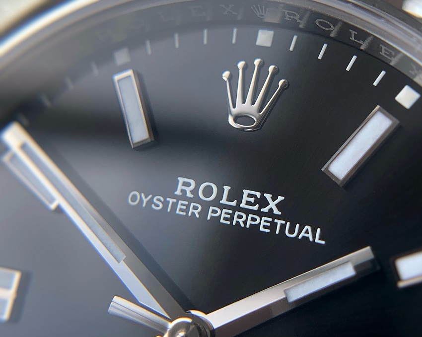
Rolex Oyster Perpetual with Crown logo
With the iconic Crown, it isn’t a huge step to grasp the nuances of what this is suggesting: Rolex as perhaps the King/Queen of watches, watches which are good enough for royalty, maybe even one watch to rule them all … take your pick! The sentiment of elitism is further underwritten by the types of events, and even individuals, that Rolex sponsors, all of which are very much best in class.
Whilst the logo might have undergone subtle changes over the course of Rolex’s history, there can be fewer emblem logos which have been as successful as that of the Crown – indeed, within the watch world you only need mention “the Crown” and people will know exactly the brand to which you are referring.
Omega – the Greek letter Ω
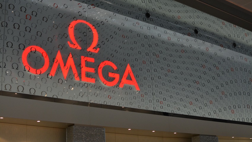
At first glance, Omega using the symbol of its namesake Greek letter seems obvious. However, there is a little more than meets the eye with this, as the name Omega (and therefore the use of this logo) are in fact a celebration of the brand’s history.
The brand we know today as Omega was founded by Louis Brandt in 1848 as Le Generale Watch Co, which later became Louis Brandt & Fils in 1880 when his two sons took over the brand. Soon after this, the brothers created their first series produced calibre called the Labrador in 1885.
With further development over the next 9 years, in 1894 they created their 19-ligne calibre, an incredibly accurate movement for which the parts were easily serviceable and maintainable by any watchmaker. This calibre was named Omega, the last letter of the Greek alphabet as if to say that this calibre was the final word, the pinnacle accomplishment. The first marketing material bearing the name Omega and the namesake letter was seen just a year later in 1895.
Following the Omega calibre’s enormous success, the name of the company was changed in 1903 to the Omega Watch Co and the rest, as they say, is history, with the brand becoming synonymous as the official timekeeper for a multitude of sporting events, and ultimately even making its way to the moon.
I think that it is important to recognise that both the logo and the brand name of Omega represent more than just the name of a company and an ‘obvious’ choice of logo that could be easily associable. In this context, what ‘Omega’ actually means takes on a whole new level of meaning: a moment of achievement in the brand’s history considered significant enough to change the name of the entire company to celebrate.
Sadly, this seems to be somewhat lost in the everyday discourse around Omega today (unless of course you go looking for it!)
Christopher Ward’s double flag logo
British brand Christopher Ward is one which prides itself on offering value for money for the watches it produces, and it is difficult to argue this point when you look at what you get for what you pay. Whilst it is a recently established brand compared to the others in this article, I particularly like the thought that has gone into their logo.
Whilst it may not be immediately obvious to look at, but the logo is in fact two “+” symbols, with the colours inverted, which is intended to represent the flags of both England and Switzerland, which are of course a white flag with a red cross, and a red flag with a white cross respectively. Once you’ve seen this, you certainly won’t ‘unsee’ it, which is to me what makes this a great logo.
The thinking behind this is that the brand’s watches are designed in England and made in Switzerland, and I think this is a great way to represent the brand in a single emblem that is a constant reminder about the story behind Christopher Ward watches and the teams that create them.
In Summary
It is very easy for us to take logos for granted today; we are bombarded with advertising from a whole host of brands vying for our attention, at all hours of the day and on a daily basis. Symbology is a hugely important part of this, with companies spending a lot of time and effort on getting it right.

Within the watch world, whist many watch brand logos tend to be the name of the brand in a stylised font, or perhaps a letter or two, there are a few which incorporate an emblem or insignia, which are carefully considered and chosen with reason. There are, of course, many other brands than those I have looked at here with such an emblem in their logo – Montblanc with its star-in-a-circle, Breitling’s winged ‘B’, Longines’ winged hourglass, the Zenith star (as seen above), and Jaquet Droz incorporating 2 stars into a ‘JD’ insignia, to name but a few, and each of which has a story to tell – if you’re prepared to take the time to explore!
If you have any questions, please get in touch via our Contact page, or via our Instagram.
You might also be interested in:
- Recommended Reading: ‘Patek Philippe – the Authorised Biography’ by Nicholas Foulkes
- Spotlight: Rolex Milgauss Green Sapphire Crystal
- My Spotlight: Omega Speedmaster ‘Tintin’
- Watch Stationery and Gift Ideas
- Watch Books, Watch Boxes and more at the Watch Affinity Shop on Amazon (commissions earned)
As an Amazon Associate, I earn from qualifying purchases – thank you for your support